
Project Overview
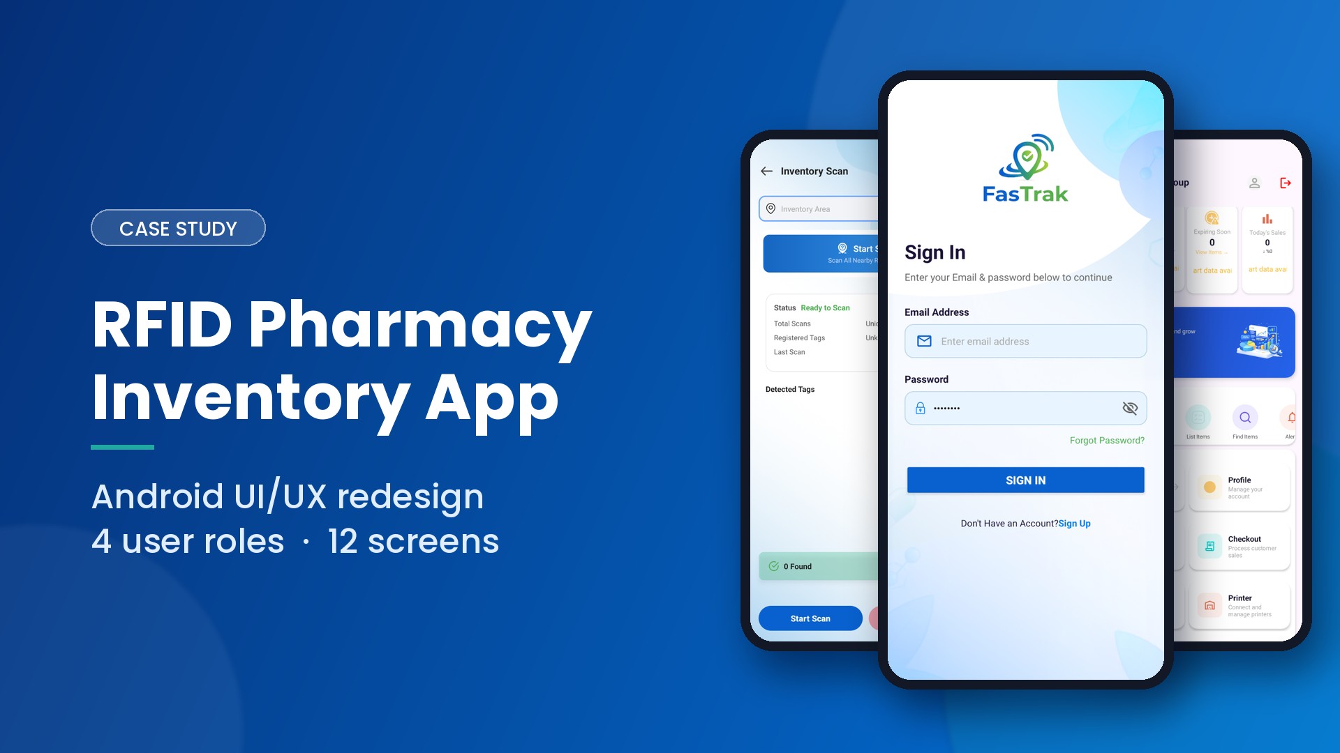
FastTrack is an RFID-based pharmacy inventory and dispensing platform for Android. Pharmacy staff scan RFID/UHF tags to track stock, check out medicines, reorder from suppliers and manage multiple branches from one app. The platform serves four user roles: Store User, Company Admin, Supplier and Super Admin.
The client came to us with a working app that had grown to more than 70 screens, but an interface that made dense inventory data hard to read during busy shifts. Our brief was a complete UI/UX redesign and a clear development estimate for rebuilding it.
App Interface



Key Features
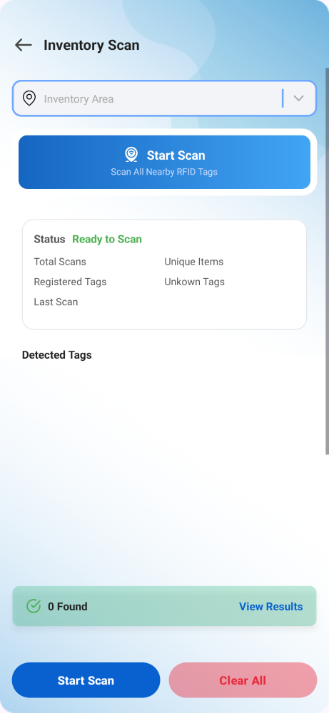
- RFID Inventory Scanning: Live UHF tag reading to count and verify stock on shelves in seconds.
- Item Catalogue: Every medicine with its batch number, expiry date, SKU and stock level.
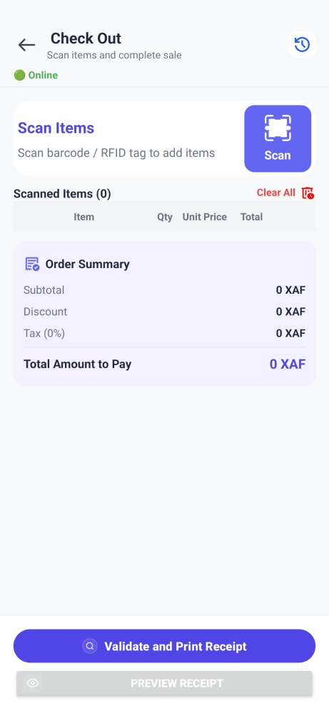
- Checkout / POS: Fast dispensing and billing at the counter by scanning tagged items.
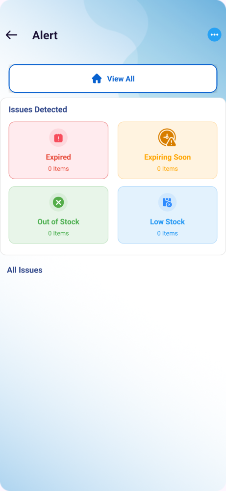
- Smart Reorder Suggestions: Flags low and expiring stock and suggests what to reorder.
- Supplier Order Management: Suppliers receive, track and fulfil orders from pharmacies.
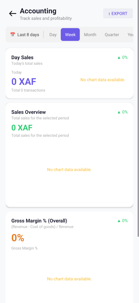
- Accounting: Sales, purchases and balances for company admins.
- ZPL Label Printing: Prints RFID/barcode labels directly to Zebra printers.
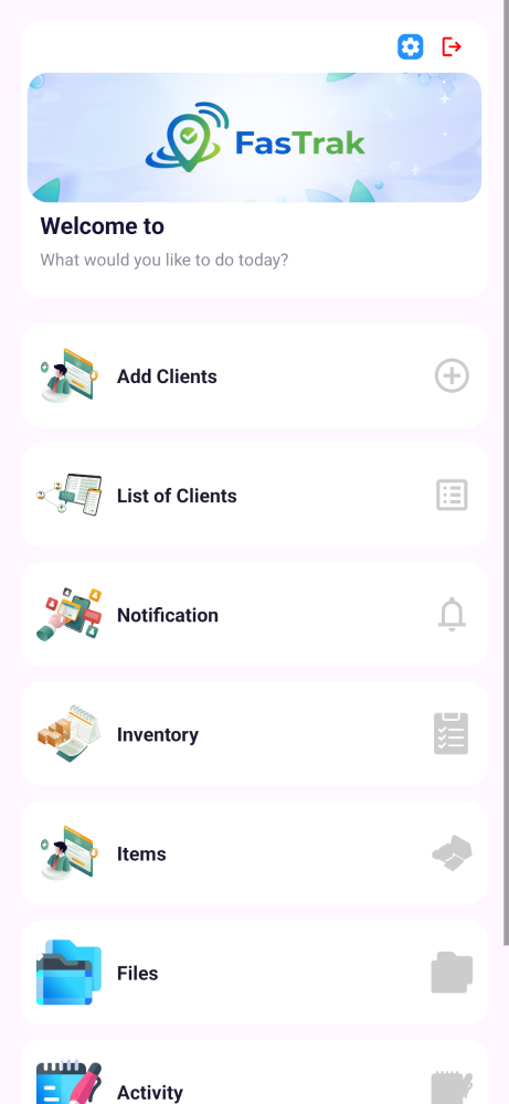
- Multi-Branch Client Management: Super admins onboard and manage pharmacy companies and their branches.
Our Design Process
1. App Audit & Discovery
- Full App Review: Analysed the existing Android app end to end, mapping 72 activities across the four user roles.
- Core Action First: Identified reading an RFID tag as the action staff repeat most, and built the new design around making it fast and obvious.
2. Design System
- Colour Palette: A calm steel-blue base with a signal-teal accent for active scanning, suited to a clinical, trustworthy setting.
- Typography: Space Grotesk for headings, Inter for body text, and IBM Plex Mono for tag IDs, batch numbers and SKUs so codes are easy to read and compare.
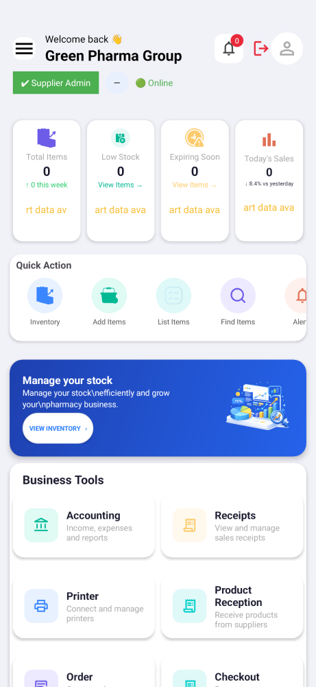
- Standard Status Colours: Green for in stock, amber for low or expiring, red for out of stock, and teal for scanning in progress, used the same way on every screen.
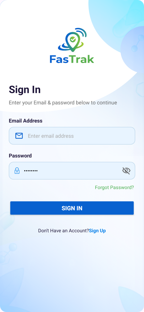
- Visual Signature: A “scan sweep” animation repeated on the login screen, the scan button and the live scan screen, so the app feels connected to the hardware it drives.
3. Screen Redesign
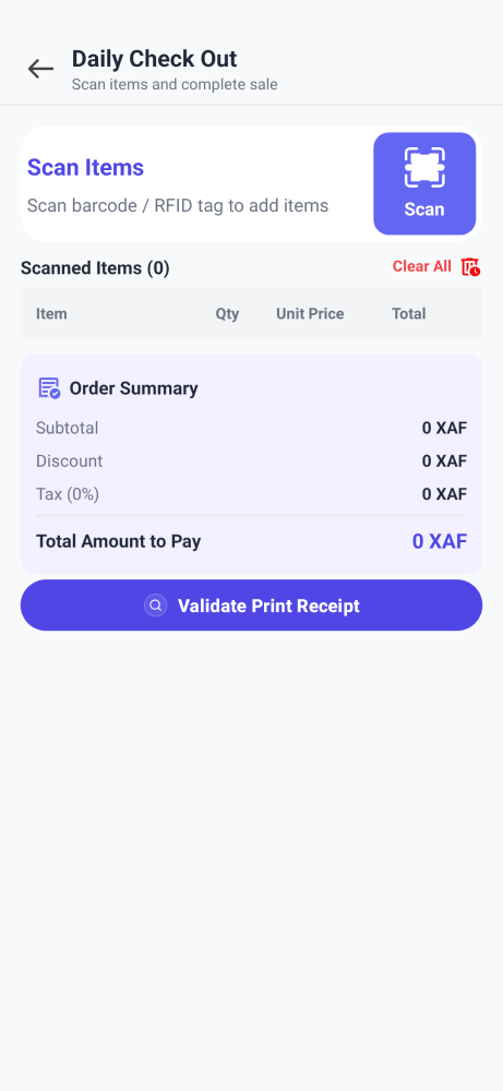
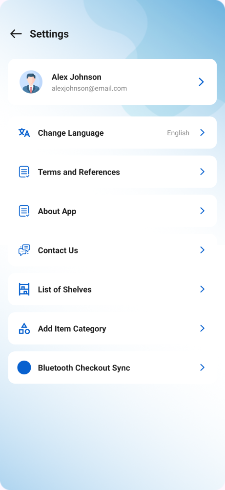
- 12 Core Screens: Login, Store User Home, Supplier Home, Company Admin Home, Super Admin Home, Checkout, Daily Checkout, Alerts, Inventory Scan, Accounting, Settings and Files.
- Role-Based Navigation: Each role sees only the tools it needs, which cuts clutter for store staff.
- Interactive Prototype: Delivered as a clickable prototype with a design-system reference panel, so the client could review the flow on a real phone frame before development.
4. Development Estimation
- Task Breakdown: Prepared a detailed time and cost estimate covering every module, grouped into 35 tasks across 7 sections.
- Developer-Ready Tracker: Shared a simple time tracker so the development team could plan, assign and log work against each task.
Outcome
The client received a complete, consistent design system and 12 redesigned screens that make stock levels, expiry dates and scan status readable at a glance, along with a clear development plan to build it. The new interface gives pharmacy staff a faster, calmer way to scan, dispense and reorder, and gives the client’s team a single source of truth for every screen they build next.